Quality resources for your expert teams
We recruit and train software engineers to equip the tech departments of technology companies.

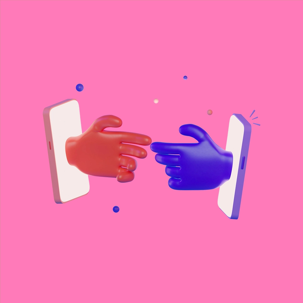
Brand identity or “branding” is the cornerstone of your difference in the market. Thoughtful and purposeful branding allows for easier identification with your brand and therefore more likely engagement with the community.
Programisto being still a young brand, we decided to share this design work to the whole team and apply the methodology Design Thinking to “get it right.” It’s about engaging all employees in the process of building an identity that:

The creative freedom that the team gave me on this brand identity creation project allowed me to build a truly differentiating universe with a lot of pleasure in the work.
Thomas, Artistic Director member of the Programisto community
A modern & expressive logotype
Programisto’s logotype is the company’s image: its design, proportions and color are invariable and intangible, its use meets certain standards that are detailed in the graphic charter. The logotype consists of the name composed in the AZO Sans (very Bold) character.

The logo is meant to be pure. We capitalize on bold, high-impact linear typography. The transparency game creating an illusion of tapping on a keyboard through a variation of shades in the typography. Sometimes this is associated with the Gimmick consisting of the “O” (target or eye of our tech vision).
Déclinaison of the logotype
The Programisto logotype needs to be declined in multiple versions in order to best adapt its use to the medium and its environment.


Preserving legibility
For legibility reasons, the logotype should never be reduced below a certain size, as this would compromise the legibility of the logotype.
For example, in our case, the logotype should not be reduced below 30 mm in length. A protection zone (rotating white) is imposed to let the logotype breathe

PROGRAMISTO’s visual identity is built around the typographic typeface Azo Sans. This linear typography exudes stability and rigor. Below, the typographies used and their different weights. The common typography used on the different communication supports will be Montserrat Medium as well as Bold for the headings.

The main palette
The palette revolves around the colors of the logotype and is broken down into the shades of the variations.

The Programisto team collaborates with the best creatives to create brand identities that stick in your mind. Check out our checklist for building a successful branding below.
Estimated time: 15 days
Before starting the creation of the visual identity, it is necessary to think about the positioning of the brand. Relying on the company’s values is a good starting point. Start by organizing workshops with the members of your team involved in the project – don’t hesitate to aim for a larger group because the identity will have to be adopted by the whole group. Your brand platform is then defined as a synthesized vision or expression of your brand identity through the lens of the most salient points of your brand DNA and differentiation.
In the early stages of designing the renewed brand identity you will define the concepts around it. However, a list of concepts, as detailed as it may be, will not generate a creative process in line with your expectations. It is now a question of building a real creative brief that will allow the team in charge of the creative phases to understand, interpret and transcribe your intentions on their deliverables. Without a well-structured and relevant brief, you will lose precious time in the brand identity creation process and your team will surely produce a half-tone result.
Choosing a typeface is not a trivial matter. To determine which calligraphic style will be used for the letters of your logo, slogan or baseline, it is necessary to do extensive research and to consult a professional in the field. Indeed, in addition to the fact that typographies are produced every day and put online in free or paid access regularly, many issues depend on this choice. Your typography will not only have to adapt to the web and to the “real world” but will also have to remain readable during its editorial or purely graphic use. A decisive choice not to be underestimated.
Your logotype represents the graphic rendering of your brand or company used to illustrate your positioning and character. It is also what is more commonly known as your “logo”; and probably what you will project yourself in the most when working on your brand identity. It can be fixed or more or less adaptable depending on its use on different media; also accompanied by a “gimmick” and / or a “baseline” if needed to convey more detailed intentions.
Depending on the presence of your brand on the different online and offline communication supports, your visual identity or brand identity will have to be thought to adapt. Indeed, a website for example may have to display content on a light or dark background depending on the navigation choices of visitors and / or situations on the overall experience. If your logo is black, you will probably want it to be white when used on a dark background: this is thought out before the identity creation phase. We recommend that you start by listing the media you plan to communicate on. A professional will help you not to forget anything during this stage.
Your brand identity or “branding” is not limited to creating a logo in a single export format. Again, it depends on your needs. But we strongly advise you to ask the person in charge of your identity creation to deliver a usage guide at the end of the project. Your logo will not be used in the same form on the different media and your typography will have to respect a regular and structured format during its editorial use to ensure a content that remains readable and digestible on the long term. Include this information in your graphic charter to keep it within your entity year after year.
The graphic charter is a fixed document that determines the main directions of your brand identity – it can be used both internally and externally and allows you to keep a graphic consistency on all your media. The charter is composed of technical and graphic parts that put the visual identity in a situation to improve its understanding by anyone consulting it.
Your team will be using your brand identity on a daily basis and in a variety of forms. Be sure to produce files that can be used by all team members and make it easy to access these resources at all times. This will save you a lot of back and forth messaging, copying and pasting of files and the gradual alteration of the work you’ve done so far. Warning, danger! This step is the only one that will ensure your team’s strong adherence to the brand identity produced.